Roles
- Lead UI/UX Designer
- Information Architecture
- Front-end development
Year
2018 - Present
Overview
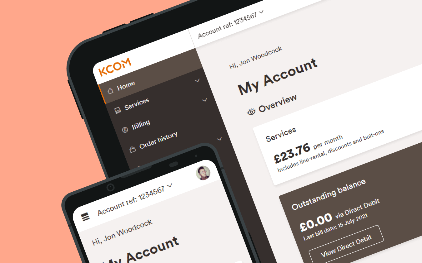
My Account is a KCOM online platform. KCOM customers use this web-based platform to help manage their telecommunications and broadband services.
They can check their data allowance, pay their bills or see how much data they have used whilst surfing the internet. I was part of the team to re-create My Account from scratch and completely rebuild it from the ground up to meet the demands of KCOM customers.
The Problem
KCOM provide internet-based and telecommunications services to over 140,000 consumers and businesses customers in the region. The business wanted to improve its customer experience and use My Account as a go-to tool for its customers to empower them to manage its services online.
The current My Account system is challenging for customers to use, making tasks like payments and finding information difficult. The business aimed to enhance the experience to encourage more customers to manage their services online, reducing the load on customer service agents over the phone.
Main Goal
The goal was to give the customers a streamlined experience, making navigating around the site as smooth as possible, focusing on accessing services and managing their accounts onlien without the need to call and delivering a great experiance.
Sub Goals
- Increase customer visits
- Help a customer view their services from any device efficiently
- Enrich the experience for the customers
Roles and Responsibilities
My role for this project was lead UX Designer. I also produced UI assets and help develop front-end components. I would also work on prototypes to help bring ideas to life when working on critical areas of My Account.
I would also attend with stakeholders for a feedback session and feature gathering. I would also conduct surveys and user testing sessions with internal team members in the customer services team who would be using the tool to help deal with customers problems.
The Team
For the project, the team consisted of a group of brilliant team members who brought together a wide range of skills and expertise to make sure we deliver a fantastic product for the customer and business.
- Jonathan Knaggs, Software Engineer
- Chris Oxtoby, Software Engineer
- Liam Walker, Software Engineer
- Danny Kay, Software Engineer
- Kieran Ward, Software Engineer
- Alex Nicolls, Software Engineer
- Steve Colbeck, QA Tester
- Pramilla Kamdam, QA Tester
- Jacob Stone, UX Designer

Research
The first thing we did was understand the customer's pain points using the old service. Then, using data from Google Analytics and implementing Hotjar in the old website helped deliver critical insight into what our customers were trying to find and accomplish.
For example, we identified one customer journey where they wanted to see what package they were on, how much they were paying, and how much data they were using. Unfortunately, the poor navigation structure and performance proved painful for the customer to access this information.
The insight highlighted vital issues that the new My Account needed to be created from the ground up as service focus first. The old system made it very difficult for the customer to find this information quickly due to poor navigation, lack of dedicated services and poor performance when trying to complete the most straightforward task.
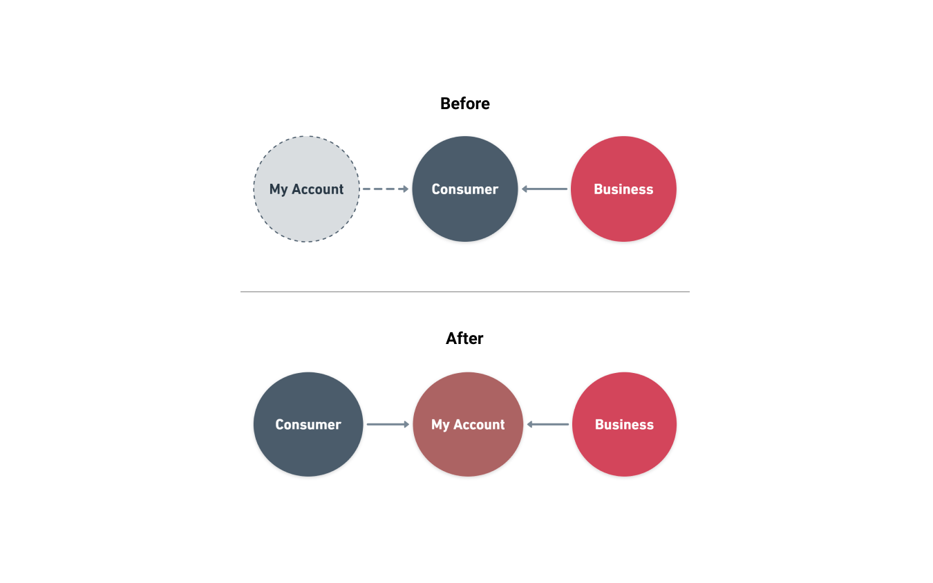
On the back of the research, the team separated the new My Account from the consumer space into a standalone service that customers can use from a business or consumer space. Doing this gives us a great foundation.
Navigation Simplified
The navigation was the next challenge that we needed to address for My Account. Before we jumped into any sketches, wireframes or development, we needed to address critical areas that customers were struggling with and make their lives easier.
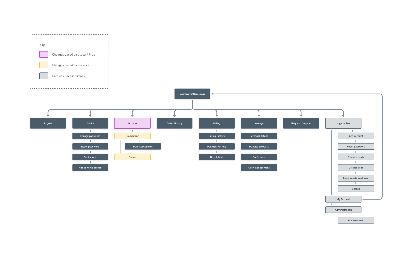
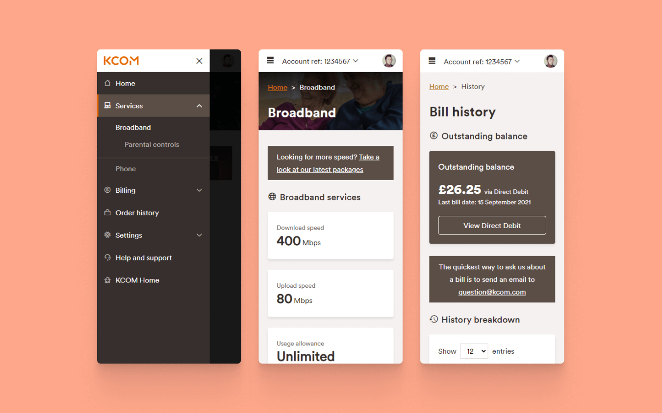
Understanding that the new websited need to be a service focused experiance. We broke down the existing site to give it a nice clean slate and tried to group them effectively according to the type of service. The types of service could potentially sit in the following key areas: product, billing, support, and so forth, so we indicated key areas the customer would need.
Multipurpose
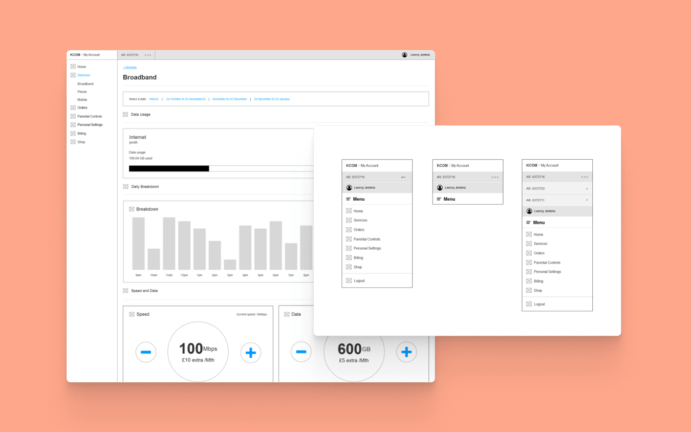
The tricky aspect of this new My Account was incorporating business into the same remit as consumer customer using the same application but giving little different experiences. Still, navigation around the website should feel the same if a consumer customer is also a business customer. They should be able to perform their task with ease. So once we were happy with the navigation structure, we decided that the navigation would be fully dynamic based on customer service and type.
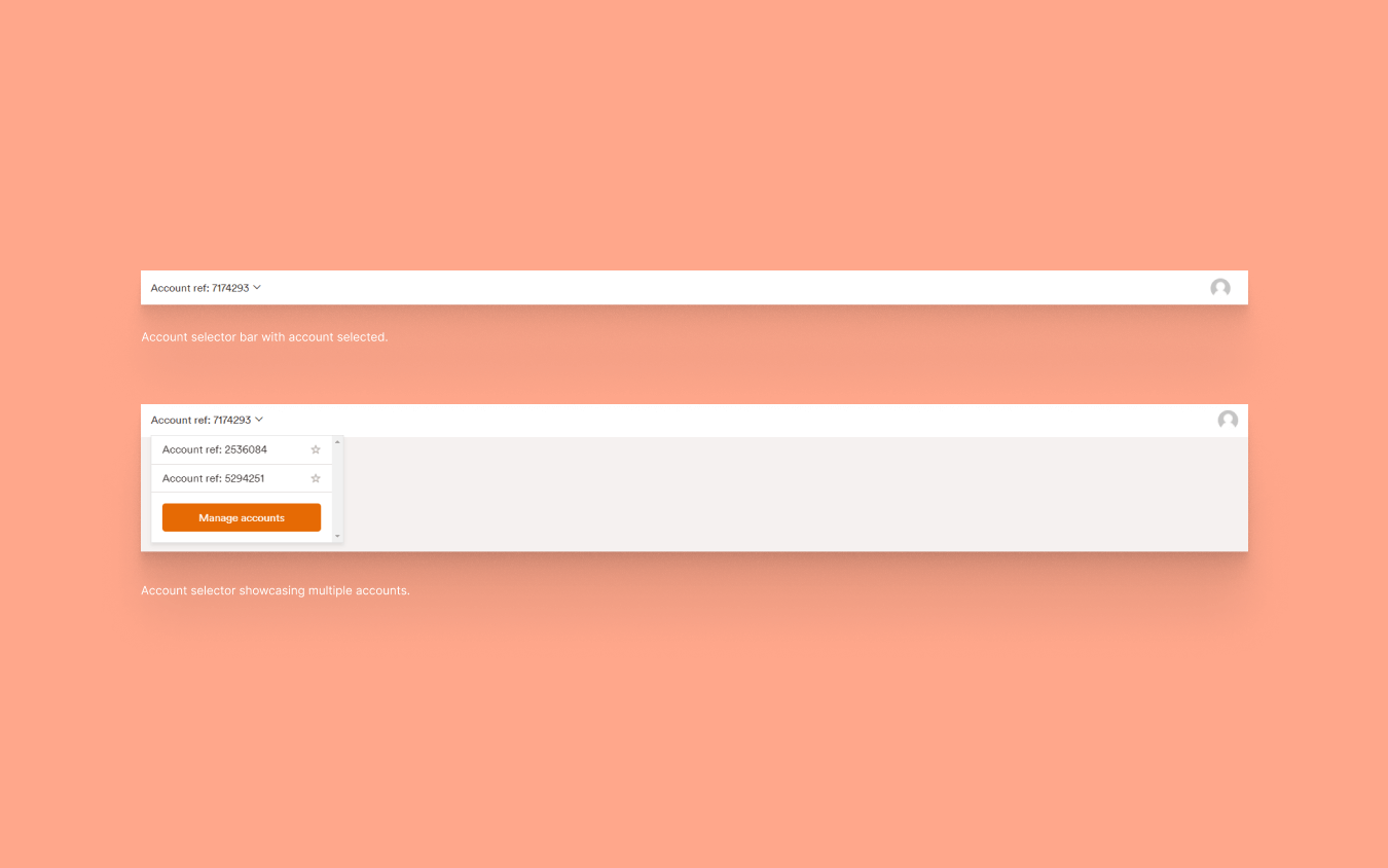
Manage Accounts
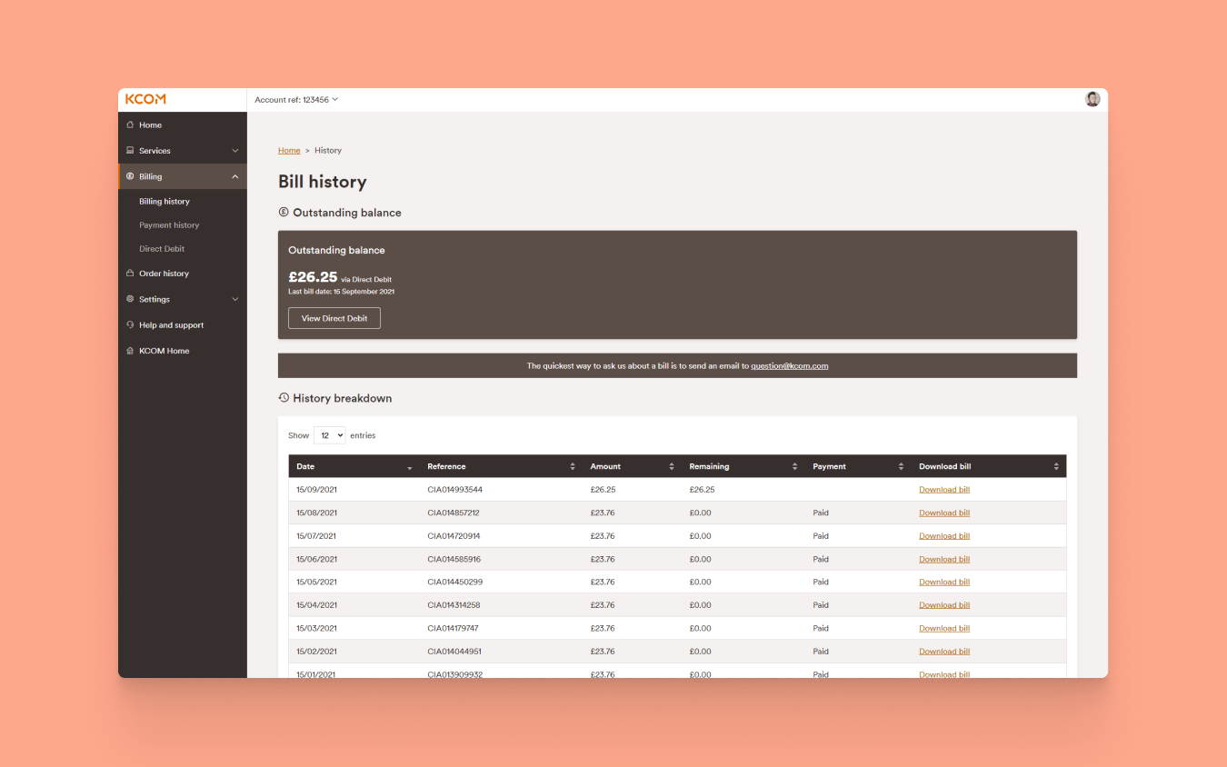
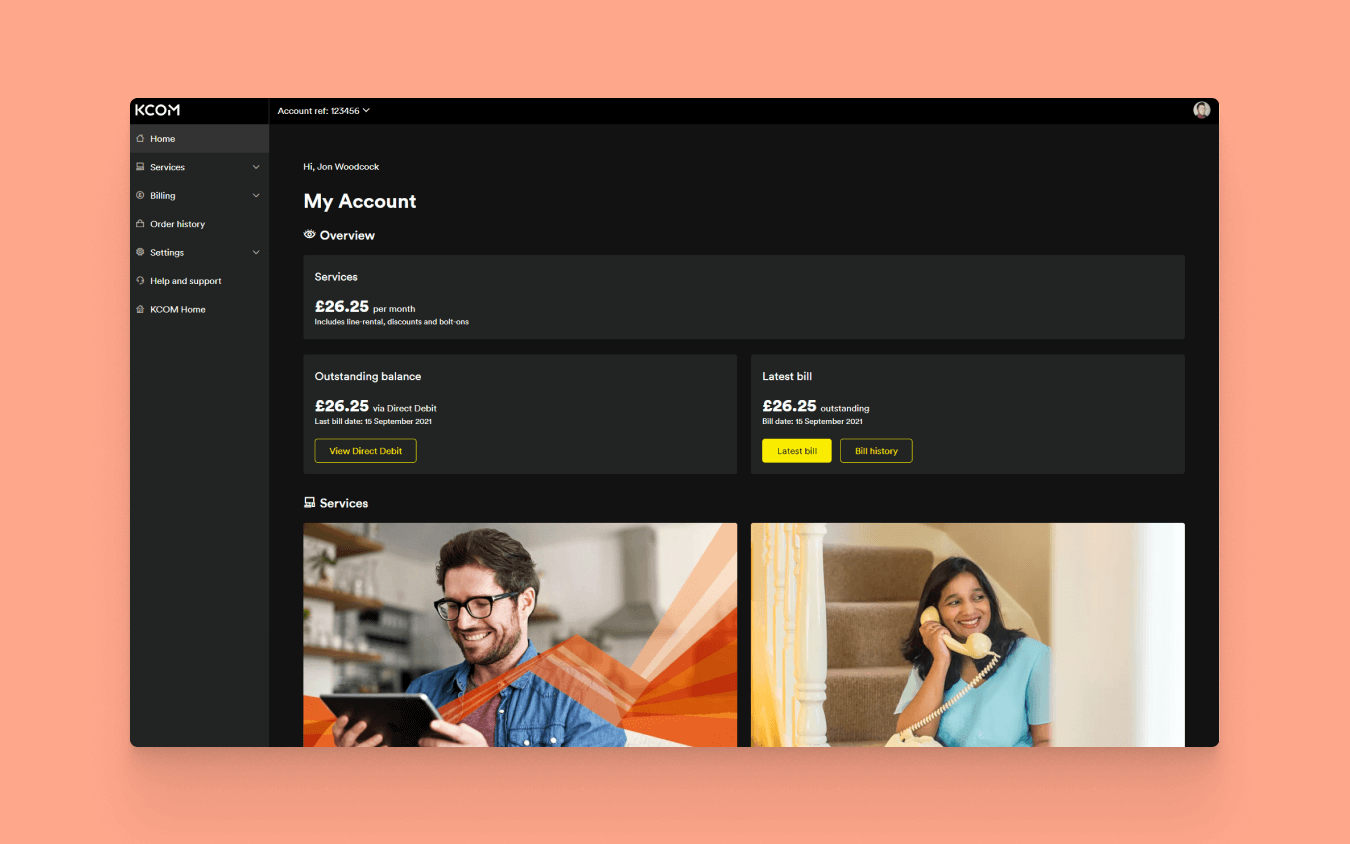
To help improve the performance of My Account. First, we needed to address the issue with accessing multiple accounts. The old My Account would pull multiple accounts onto one page and present each account details stacked on each other. Thus, each account accessed information simultaneously, which heavily reduced the website speed because of the number of requests it was performing.
Because of this, it created a ripple effect, difficulty accessing other areas of the website, customers leaving because the time to load information was taking too long and generally making problems.
Addressing the problem
The team re-built the functionality to address how the data is called and pulled back by making asynchronous calls. Thus, improving how the system pulled large amounts of data back. In addition, we introduced an account selector on the front-end, and this dropdown list would hold all accounts but will only show one chosen by the user.
If a customer wants to select a different account to view, they can choose what they want, and the system reloads the page pulling the data just for that account, saving time and performance. This solution solved many issues but ultimately gave the user greater control.
We also introduced a nice feature, the ability to favourite an account. It would automatically load up when the customer visited My Account. We implemented this feature to improve efficiency for the customer ultimately save time.
Visual details
Responsive Design
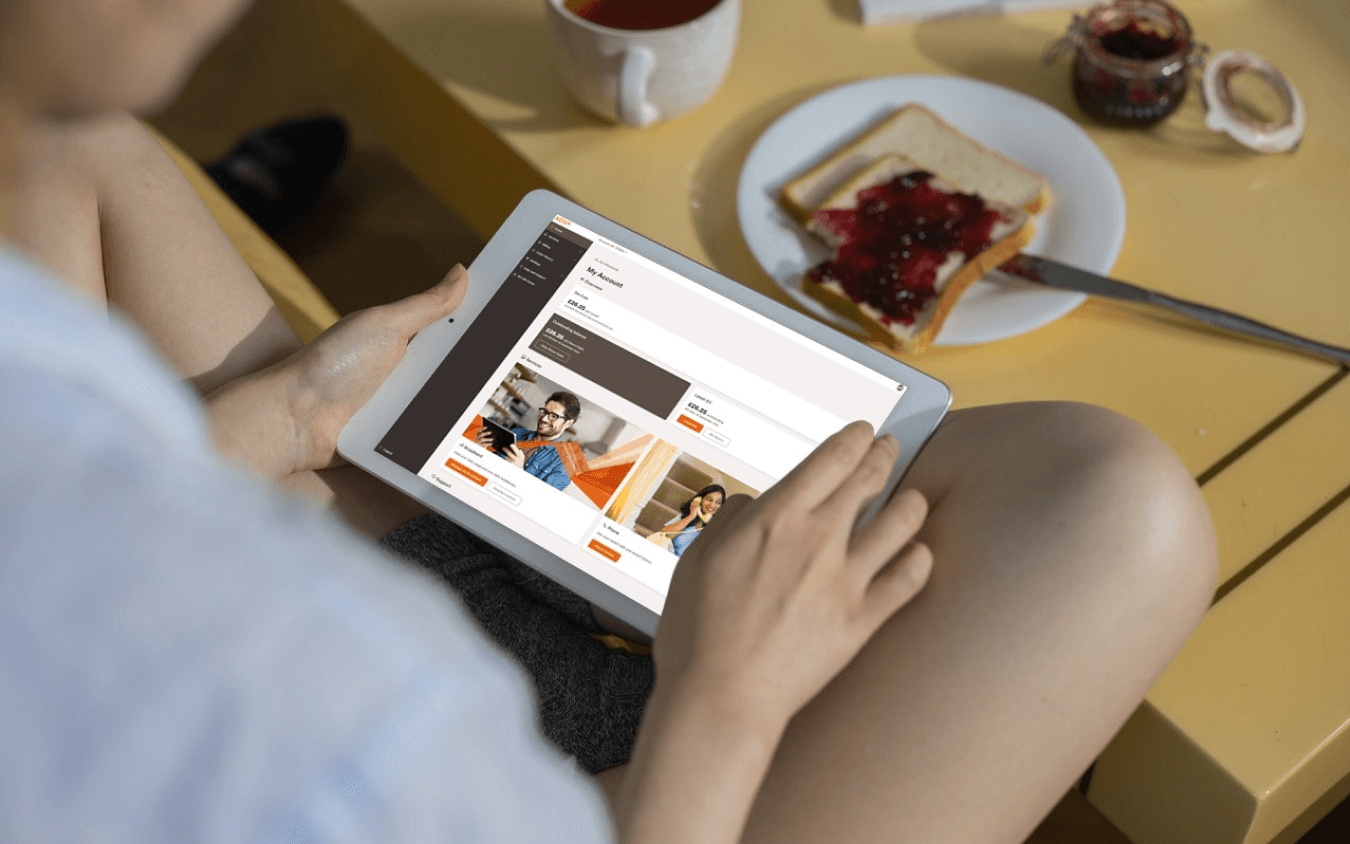
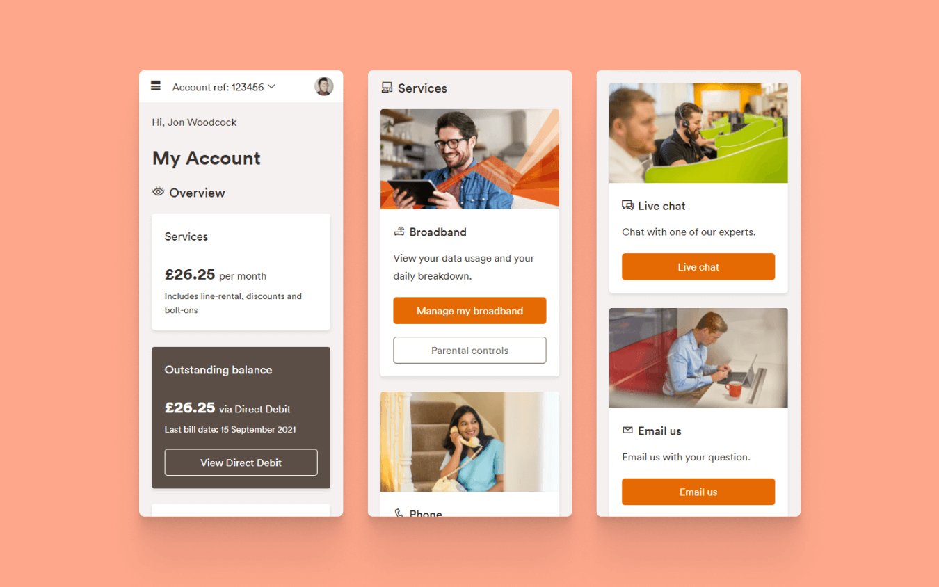
The new design is fully responsive. It is designed and developed mobile-first My Account needed to be accessible across multiple devices easily. With the rise of mobile browsing, we want the customers to have a great experience on whatever device they are using.
Fixed Navigation
There are three core areas of My Account the header, sidebar and main content. The header and sidebar are the key navigation areas for the customer to access services and pages and are created to be fixed. I went for this approach because I wanted the navigation to be with the customer throughout the journey.
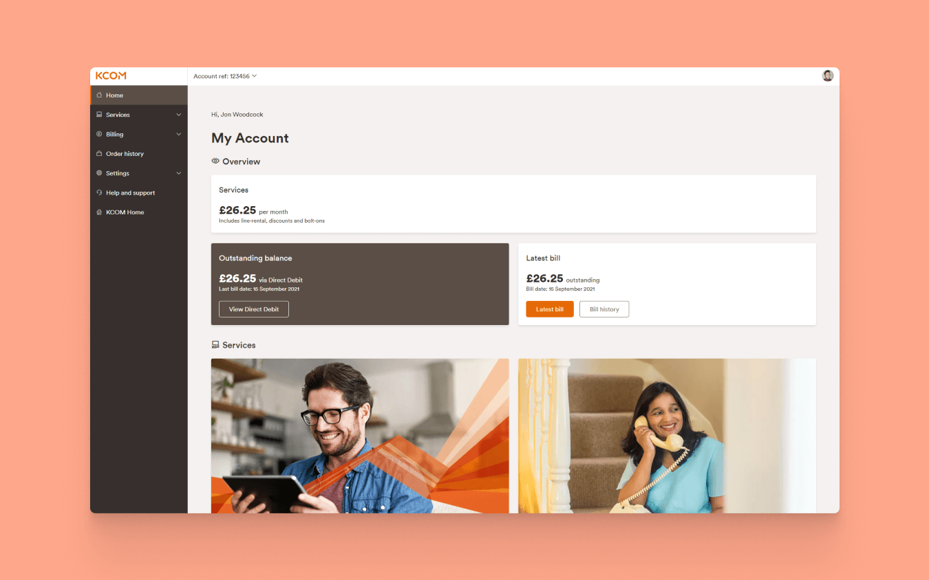
Clear Panels
Panels are used across My Account to help break down critical identifying areas, for example, direct debit, parental control within broadband service. Customers needed to access with ease, and utilising these panels helped convey the customer's information and services.
Building block
Developing front-end components and prototyping, I was hugely inspired by the work of Brad Frost and his work on Atomic Design. Utilising this methodology helped My Account be easily maintainable, adapt to change and help improve performance. I would start documenting these components into a handy design system that the team could reference when building key functionality. I wanted them to have the flexibility and confidence to create pages themselves using these components to help improve speed within the development.
Accessibility
Responsive Design
With KCOM large customer base, we needed to make My Account accessible as much as possible. Tackling this aspect was very important to me as an advocate for accessibility and inclusive design to help users have a significantly positive experience using My Account and give them the confidence to use our services time and time again.
Keyboard Compatibility
My Account can be utilised using a keyboard. It was important building the site from the ground up that this functionally continued through the process so r our customers how may have poor mobility or blind and using a screen reader can effectively complete their with no hindrance to the experience.
High Contrast Theme
I introduced a high contrast theme that we called Dark theme into the system to give the customers a choice and help customers with low vision, colour blind, and maximise legibility. The great thing about the theme selector is that using cookies, it remembers which theme you selected, so if you return to use the system, it will keep the same theme for you, which adds a personal touch to the user experience.
The Small Things
With accessibility, the tiniest changes do create a significant positive impact for the user. For example, we give buttons accessible names to help screen readers indicate the type of button and what the button purpose is. We also made sure generic links had underlined, so they were identifiable as clickable links. I also tried to make sure that any iconography used would best try to represent its areas. Utilising these small changes, I believe it helps us create a more inclusive experience and putting the customer at the heart of it.
Accomplishment
The whole project took over 12 months to complete and launched on the 1st of April 2019. We have continued to release updated features and continually improve the system further.
Overall, the whole project was a success, with stakeholders very pleased with the final result. In addition, the team can be very proud of what they produced and achieved. Still, ultimately, it has enabled the customers to have control over their services, and it's a significant step forward for My Account to be a complete all-inclusive, self-service application.
Achievements
- As of the 1st of April 2021, we had over 3 million page views
- Our broadband service page makes up nearly makes up 17% of total visits to My Account
- Our PAYG customer users are paying their bills online more
- Our customers use mobile phones more when using My Account. Over two years, mobile users have slightly overtaken desktop at 45.4%, which is fantastic to see more customers utilising mobile devices using KCOM services
Next steps
- Provide full self-service capabilities for customers to upgrade/downgrade their services on the go
- Turn My Account into a progressive web application to support push messages and show notifications to help provide for customers needs
- Deliver more in-depth data usage for customers to see what they spend most of their time on and how they are using the internet, and help us understand how we could improve services in the future